Skip to content
Woman to grump man: “I’d forgotten how pissy you get when one of your tweets gets ratioed.”

Twitter math

Twitter math published on

Ratioed (see also “the ratio”): When a tweet garners more comments than likes, suggesting it is unpopular.

Square rooted: When the number of comments on a tweet is the square of the number of retweets, suggesting your followers aren’t into sharing and probably didn’t watch Sesame Street.

Quadraticked: When the pace of likes on a tweet over time (t) = at^2 + bt + c. If a is a positive value, it suggests the tweet was popular, then overexposed, then became kind of retro-hip. If a is a negative value, it suggests people are messing with you. (Note that most of the time you will also have a negative number of likes. So, high school all over again.)

Logarithmicked: When the number of likes is the exponent to which a tweet’s character count must be raised to equal the total number of Twitter users, suggesting the advent of Gnarr the Destroyer is at hand.

Sudokued: When the digits in a tweet’s number of likes, retweets and comments, along with its character count, can be arranged in a grid to form a simple, diverting puzzle, suggesting the singularity has occurred and we all missed it.

Fibonaccied: When the number of likes on a tweet equals the character count, the number of retweets equals the character count plus the number of likes, the number of comments equals the character account plus the number of retweets, and the number of followers on the tweet’s account equals the number of comments plus the number of retweets, suggesting you’re reading too much into your metrics.

(Captain Renaud from Casablanca) Major Strasser has launched a social media strategy. Round up the usual metrics.

I came to Casablanca for the retweets. I was misinformed.

I came to Casablanca for the retweets. I was misinformed. published on No Comments on I came to Casablanca for the retweets. I was misinformed.

Some of the advice I’ve seen around social media measurement boils down to “Don’t pay attention to x. You should be measuring y.”

Don’t pay attention to retweets; you should be measuring follower growth. Don’t pay attention to follower growth; you should be measuring post likes. Don’t pay attention to post likes; you should be measuring FlegmaRank, our proprietary new index based on a secret algorithm that boils eighty thousand different variables into a single integer between 0 and 1.

It’s enough to drive an online campaigner to drink… or, more productively, to the bookshelf. This stuff is why I was so pleased to draw the cartoons for Beth Kanter and K.D. Paine’s Measuring the Networked Nonprofit. And why I loved reading Katie’s Measure What Matters. And (this’ll take you back) Avinash Kaushik’s Web Analytics: An Hour a Day. (I’d link to it, but he has a more recent follow-up, Web Analytics 2.0.)

What all that advice really should boil down to is this: what do you want your online efforts to achieve? How do you believe they’ll do it? (That is, what’s your theory of change?) How can you measure each stage of the mechanism underlying your theory? How can you benchmark against peers, competitors and past performance? And how can your measurements help you assess your model against real-world results, and adjust accordingly?

Answer those questions, and you’ll know which metrics matter. (They may be the usual suspects. They may not. Chances are they’ll be some of each.) Everything else is noise.

Metrics

Metrics published on No Comments on Metrics

Key Performance Indicator, in case you’re wondering.

Chasing numbers

Chasing numbers published on No Comments on Chasing numbers

I don’t believe in chasing metrics for their own sake. I really don’t.

But for the past month, Noise to Signal has hovered tantalizingly close to 2,000 fans on Facebook, and dammit, I really like it when the cartoon reaches more people. If an arbitrary number can help make that happen, then by god, I’ll embrace that arbitrary number and tickle it under its chin.

So I posted that if we can crack that 2,000-fan barrier tonight, I’ll post next week’s cartoon today:

I have a cartoon that I’m planning to post next week. But if you fine people can convince 18 more people to like the page and crack 2,000, it’ll go live RIGHT AWAY. (Why? Because I like round numbers and because my subconscious is convinced that more Likes mean I won’t die alone and unloved someday.)

And my old friend Kevin Marsh from my Queen’s Park days replied that he might be game for it if I post a cartoon about my subconscious. And here it is.

The offer still stands. Next week’s cartoon awaits just 18 more Facebook Likes.

(In case you’re wondering, yes: I went back and forth over whether to say “shitload”. I ultimately went with it because I think it’s funny as hell when a monk says “shitload.” In many ways, I never really stopped being 12.)

14. Measuring the impact of the crowd

14. Measuring the impact of the crowd published on No Comments on 14. Measuring the impact of the crowd

Over the past few weeks, I’ve been posting cartoons I drew for Measuring the Networked Nonprofit: Using Data to Change the World, by Beth Kanter and Katie Delahaye Paine. I blogged about the book a while ago on Social Signal, explaining why I love it.

This is the final cartoon in the series. So go buy a copy right now so Katie and Beth will have to write another book! And then make effective measurement one of your new year’s resolutions.

>>> *** <<<

Chapter 14 is the conclusion, and it’s both the most inspiring and the scariest part of the book. Inspiring, because it’s about your organization’s fundamental goals. And scary, because it’s about whether you’re achieving them – or, in the inspired words of a New Yorker cartoon, whether it’s “just so much pointing and clicking.”

Maybe that’s ultimately why so many of us still resist measurement. The warm, furry comfort of thinking we might be making progress is a lot more alluring than the threat of cold, clammy certainty that we’ve been spinning our wheels. Not that we’d make that calculation consciously; it just makes us that much more willing to postpone thinking about something as big and daunting as a measurement strategy.

Which is why Beth and Katie’s book is important. Really important.

It’s important because it breaks the enormous idea of a measurement strategy into far more manageable pieces, each with its own practical steps and potential wins. And for managers and leaders who can never seem to set aside a huge chunk of time and attention, that means a chance to at least take the first step, and then the second… until you’ve made enough progress to make a more ambitious commitment to measurement possible. (Crawl, walk, run, fly, as Beth says.)

And it’s important because while we do need a little fear to push us — when the monster in the closet is real, pretending it’s imaginary doesn’t work — we also need the pull of inspiration. In case after case, Katie and Beth show us how using measurement in an intelligent, thoughtful way can mean we have more impact, in terms of genuine meaningful change.

We can identify the tactics that aren’t working and redirect their resources to tactics than do; we can take strategies built on wishful thinking and ground them in certainty. And whether we measure the resulting progress in lives saved, jobs created, houses built, animals rescued, crimes prevented, wells dug, gardens tilled, hectares set aside for conservation, families lifted out of poverty or children united with new parents, we can know – know – that we are changing the world.

Have a fantastic, inspiring and measurable 2013.

12. Influence

12. Influence published on No Comments on 12. Influence

Over the next several days, I’m posting cartoons I drew for Measuring the Networked Nonprofit: Using Data to Change the World, by Beth Kanter and Katie Delahaye Paine. I blogged about the book a while ago on Social Signal, explaining why I love it and why I think you should go buy a copy right now.

11. My God, it’s full of nodes!

11. My God, it’s full of nodes! published on No Comments on 11. My God, it’s full of nodes!

Over the next several days, I’m posting cartoons I drew for Measuring the Networked Nonprofit: Using Data to Change the World, by Beth Kanter and Katie Delahaye Paine. I blogged about the book a while ago on Social Signal, explaining why I love it and why I think you should go buy a copy right now.

↑
N
|
W———•———E
|
S

Chapter 11 is called “Understanding, Visualizing and Improving Networks,” is your introduction to the world of network analysis. That’s a dry-sounding term for a truly juicy topic: mapping and understanding your organization’s network of support and attention.

Why juicy? Because mapping your network takes an abstract concept and makes it visual – and once it’s visual, you can draw sudden, unexpected, profound insights.

For example, thanks to that map of Middle Earth on the opening pages of my copy of The Lord of the Rings trilogy, I knew long before any of the other characters that one really doesn’t simply walk into Mordor. (Also, that a horse-drawn wagon had jacknifed on the Old Forest Road and that drivers should take alternate routes to Mirkwood.)

Possibly more relevant is your ability to see who the hubs and influencers in your network are, and who’s on the periphery – where growth can take off. You can find gaps, identify weak and strong ties, and start measuring the value of your network. You can use something as sophisticated as an Excel plug-in, or as low-tech and analog as sticky notes.

Best of all, you can have a perfectly rational reason to create one of those Carrie-Mathison-style walls-of-clues-and-connections of your own. (Disclaimer: this is insufficient justification for doing this on behalf on your organization. But what you do on your own time is your own business.)

10. How many hectares is that relationship?

10. How many hectares is that relationship? published on No Comments on 10. How many hectares is that relationship?

Over the next several days, I’m posting cartoons I drew for Measuring the Networked Nonprofit: Using Data to Change the World, by Beth Kanter and Katie Delahaye Paine. I blogged about the book a while ago on Social Signal, explaining why I love it and why I think you should go buy a copy right now.

<3 <3 <3

Chapter 10 takes you into advanced measurement, starting with how you measure relationships. Relationships are at the heart of social media; they’re the nucleus around which all else revolves. You can’t make the piñata of change without the papier maché of relationships – and yes, that metaphor is available for re-use under a Creative Commons license. You’re welcome.

But how do you measure relationships, and the value they offer? The book points to the surprisingly straightforward approach pioneered by professors James and Larissa Grunig, and how organizations can apply it to their own relationships. And as for value…

“Make a friend before you need one,” my communications mentor Dennis McGann used to tell me, and two anecdotes from the book bear his wisdom out: one, the online conversation that ensued after the accidental death of a SeaWorld trainer, and two, the way the American Red Cross was able to turn a Twitter misfire into a fundraising opportunity.

The latter incident saw a staffer tweet about getting drunk on Dogfish Head’s Midas Touch beer. Normally, that would be fine, except the employee used the official Red Cross account, which usually uses hashtags like #hurricane or #relief, and not – let me just check the spelling – #gettngslizzerd.

The organization responded swiftly, deleting the tweet but also explaining it wittily. Dogfish Head, meanwhile, encouraged its followers to donate to the Red Cross. They raised nearly $10,000, briefly crashing the Red Cross server and helping #gettngslizzerd to trend on Twitter.

The lesson is clear: when life gives you lemons, make beer.

9. Meowtrics and measurement: using your data to change the world

9. Meowtrics and measurement: using your data to change the world published on No Comments on 9. Meowtrics and measurement: using your data to change the world

Over the next several days, I’m posting cartoons I drew for Measuring the Networked Nonprofit: Using Data to Change the World, by Beth Kanter and Katie Delahaye Paine. I blogged about the book a while ago on Social Signal, explaining why I love it and why I think you should go buy a copy right now.

/\/\    __/
=ºi º= /
 ww--ww

In Chapter 9, “Measurement and the Aha! Moment: Using Your Data to Tell Stories, Make Decisions and Change the World”, the rubber really hits the road. And because we’re changing the world, both the rubber and the road are made from reclaimed and recycled materials; the vehicle is electrically driven and charged from a wind-turbine-powered grid; and it’s actually not on the road at all because we’re taking modern commuter rail instead.

This is where you dive into the data and find actionable insights.

Roy Neary serves dinner

Side effects of reading this chapter include dramatic improvements in organizational effectiveness, and a compulsion to construct bar graphs out of Cheerios at the breakfast table – kind of like Roy Neary in Close Encounters of the Third Kind, only with data visualizations rather than perfectly-scaled replicas of Devil’s Tower.

And as with Roy Neary, your loved ones will still think you’re nuts, and your living room will end up filled with mud and the neighbours’ shrubs. (Actually, the mud may just be because I’ve misconfigured Google Analytics.)

In fact, one of the more exciting things you can find is a Devil’s Tower-shaped plateau in your metrics: not just a short-lived spike, but a significant, sustained increase in some measurable variable that matters to you. One such Devil’s Tower led Beth to start regularly posting Fun Geeky Friday Shares on her Facebook Page.

Also in this chapter, Katie makes a pretty compelling case that measurement is hawt.

8. Someone’s Looking at You: The Fine Art of Measuring

8. Someone’s Looking at You: The Fine Art of Measuring published on No Comments on 8. Someone’s Looking at You: The Fine Art of Measuring

Over the next several days, I’m posting cartoons I drew for Measuring the Networked Nonprofit: Using Data to Change the World, by Beth Kanter and Katie Delahaye Paine. I blogged about the book a while ago on Social Signal, explaining why I love it and why I think you should go buy a copy right now.

___ ___ < • > < • >

Chapter 8, “Measurement Tools: How to Choose and Use the Right Tool for the Job,” will break your heart in two short sentences:

Many nonprofits think that fancy analytics or monitoring software will provide them with actionable information with just a click or two. This is seldom the case.

Dang. (By which I mean something less family-friendly.)

Fortunately, the work involved in turning data into insight can be actual fun. Katie and Beth walk you through choosing the tools to use (web analytics? a survey? content analysis?) depending on your goals and strategy, with an overview for each one. The section on surveys alone may be brief, but it’s worth the price of the book for anyone who’s been fumbling uncertainly with SurveyMonkey and wondering why they get such poor results.

Meanwhile, allow me to deploy a tool of my own to better understand my readers. By completing this survey, you’ll be entered to win a… um… uh… another cartoon tomorrow.

7. Me dot org

7. Me dot org published on No Comments on 7. Me dot org

Over the next several days, I’m posting cartoons I drew for Measuring the Networked Nonprofit: Using Data to Change the World, by Beth Kanter and Katie Delahaye Paine. I blogged about the book a while ago on Social Signal, explaining why I love it and why I think you should go buy a copy right now.

$

Chapter 7 is titled “How to Turn Your Stakeholders into Fundraisers: Social Fundraising and How Measurement Can Make It More Effective”. (After seeing an early outline, I wanted to call it “Turning Philanthropy into Philanthro-we“. How history might have changed if I’d ever hit “send” on that email.)

Beth and Katie suggest defining social fundraising as “people asking personal networks to give support.” If you’ve ever had a Facebook notification that a friend suggested you donate to a particular organization on Causes, or seen any of the endlessly inventive campaigns run by supporters of charity: water, you’ve seen social fundraising.

And it can work well. But taking it beyond just “let’s ask our supporters to put a widget on their blogs” requires fundraising expertise, social savvy, some decent technical chops… and smart measurement. If the Obama campaign’s message and tactics seemed to be constantly evolving, it’s because they were – in response to the data they’d analyze obsessively over what kind of appeals worked on whom, when, and under what conditions. (To put it in terms that I can relate to, “The Borg have adapted to our multi-phasic shielding, Captain – their last three appeals got through untouched and caused major donations on Decks 12 through 15.”)

Warbler as seen through a telescope
Flickr photo: Yellow-throated warbler by hart_curt

Segmenting your audience is key, too. Katie and Beth look at how Blue State Digital’s segmentation strategy dramatically boosted the chances that an email appeal from Autism Speaks would get opened by its recipient. (I love segmentation purely on the strength of the names marketers like to give their segments: “Furious Experimenters,” “Jazz-Inflected Repeat Adolescents” and “Regret-Tinged Revenge-Seekers”. Half of them sound like they were lifted from the pages of an Audubon field guide; come to think of it, the notes that accompany segmentation reports often have that observed-from-inside-a-bird-blind feel to them.)

And as the authors point out, the return you get won’t just be in the form of credit card authorizations. You’ll have a larger, more engaged network of supporters, ready to take actions ranging from advocacy to, potentially, organizational leadership.

(An aside: Turning stakeholders into fundraisers was thought for a long time to be fraught with danger. Sure, you’d probably get some lovely networked fundraising… but what if it went wrong? What if you ended up with fund-holders and stake-raisers? Almost inevitably, pundits warned, you’d have an angry stake-wielding crowd chasing people holding fistfuls of cash. But then it actually happened, and was called Occupy Wall Street. It turns out that crowd just uses their stakes to hold up hand-lettered banners and enormous effigies representing leading economists from the Austrian School, chanting “Hey hey, ho ho, slavish adherence to the ideas of Eugen Böhm von Bawerk has got to go!”)

6. “OMG, what happened to you?!” “I fell off our engagement ladder.”

6. “OMG, what happened to you?!” “I fell off our engagement ladder.” published on No Comments on 6. “OMG, what happened to you?!” “I fell off our engagement ladder.”

Over the next several days, I’m posting cartoons I drew for Measuring the Networked Nonprofit: Using Data to Change the World, by Beth Kanter and Katie Delahaye Paine. I blogged about the book a while ago on Social Signal, explaining why I love it and why I think you should go buy a copy right now.

|_|
|_|
|_|
|_|
| |

Chapter 6 is titled “The Ladder of Engagement: How to Measure Engagement and Use It to Improve Relationships with Your Stakeholders”. The authors walk us through the idea of online engagement that draws users into increasingly greater and more meaningful actions. You might start by following an organization on Twitter, then commenting on their blog, then making a small donation, and then giving them your house and becoming their Executive Director, and wondering how all of this happened in just three minutes. (That, friends, is what great interaction design can do.)

With some organizations, it really isn’t a ladder so much as a step-stool. They have a very limited number of roles for their supporters, and can’t really imagine how they could possible accommodate someone who’d like to work outside those boundaries. “Oh, you’d, uh, you’d like to get more involved (gulp) beyond writing a cheque every year. (gasp, pant) That’s great, that’s just wonderful. (ragged, rapid breathing) Could, could you please hand me that paper bag to breathe into for a moment? Never mind – I’ll be fine. Gosh, the room’s lovely when it spins like that. (thud)” For them, there’s Beth’s previous book (cowritten with Allison Fine), The Networked Nonprofit

5. A theory of change we can believe in

5. A theory of change we can believe in published on No Comments on 5. A theory of change we can believe in

Over the next several days, I’m posting cartoons I drew for Measuring the Networked Nonprofit: Using Data to Change the World, by Beth Kanter and Katie Delahaye Paine. I blogged about the book a while ago on Social Signal, explaining why I love it and why I think you should go buy a copy right now.

-<  ºº>•
”   “

(That little separator was intended to be a hamster. So now you know why my preferred drawing tool is a stylus and not a keyboard.)

Chapter 5 is titled “Don’t confuse activity with results,” which ought to cause us all some deep-seated soul-searching. It’s so easy to fall into patterns of behaviour, trot out the same shopworn tactics for campaign after campaign, and never ask the basic question, “Is this actually getting us anywhere?”

Katie and Beth say it’s time we held our activity accountable. (Giant puppets at protest rallies, tremble; you may have just heard your death knell.) And they recommend placing that activity in the context of a theory of change: a causal chain that begins with your tactics and ends – we hope! – with some measurable progress toward your goal.

A theory of change allows you to demonstrate the value of something like social media, where returns can be indirect and qualitative, resisting easy conversion to a dollar value – but which may be every bit as valuable as a cashier’s cheque. Beth and Katie (whom I may start calling “Kanter and Paine,” because it sounds like either a Broadway musical-writing duo or a don’t-f*ck-with-us law firm) prefer that to talking about ROI, an accounting term that often doesn’t capture the value in network- and relationship-building.

That’s an excellent reason to develop a theory of change. Here’s mine: it’s a powerful tool for motivating people, especially if they’re skeptical that what you’re asking them to do will have an impact. Your supporters, volunteers or staff may be asking “Why will this e-petition work when every other one I’ve signed had no impact?” or “I’ve never posted an online video before. Why should I believe it will make any difference?” A theory of change can be the story of just how their action will help to change things — and can inspire them to tweak their action for maximum impact.

woman hefting cat in the air and kissing it for increasing her non-profit's CTR and fundraising results

4. You cannot resist the kitteh

4. You cannot resist the kitteh published on No Comments on 4. You cannot resist the kitteh

Over the next several days, I’m posting cartoons I drew for Measuring the Networked Nonprofit: Using Data to Change the World, by Beth Kanter and Katie Delahaye Paine. I blogged about the book a while ago on Social Signal, explaining why I love it and why I think you should go buy a copy right now.

* * *

Chapter 4, “Measurement is Power,” is not the punchline to an elaborate pun on the meaning of “ruler”. (As awesome as that would be.) Instead, it looks at how you can take the insights you glean from data, and turn them into actions with bottom-line impact. Notice that engagement grows when you add a little personality to your Facebook posts (as Kearny Street Workshop‘s Lisa Leong did), and you can direct more attention to a personal voice… and ultimately bring more visitors through your doors.

As you begin reading this chapter, you will encounter the idea of KPIs: Key Performance Indicators. A chill may have gone up your back just now, and I understand why, but be advised that learning about KPIs does not turn you into a soulless automaton, eyes fixed on a limited set of metrics and dead to the richness of the world around you. Provided, of course, that you pace yourself, and follow these simple tips:

  • Do not learn about KPIs while having Excel and PowerPoint open at the same time.
  • Pause periodically – every 20 seconds or so should be about right — and meditate for a half-hour or so.
  • Wear something – anything – made out of hemp.
  • Never play golf again.

(By the way, this cat was just about my favourite thing to draw, ever, surpassing “giant robot destroying city” and “giant winged lizards destroying world“. I probably spent the better part of a day on her.)

The risks of hanging your graphs 90º off-kilter.

3. Come for the data. Stay for the insight.

3. Come for the data. Stay for the insight. published on No Comments on 3. Come for the data. Stay for the insight.

Over the next several days, I’m posting cartoons I drew for Measuring the Networked Nonprofit: Using Data to Change the World, by Beth Kanter and Katie Delahaye Paine. I blogged about the book a while ago on Social Signal, explaining why I love it and why I think you should go buy a copy right now.

~~~

Brent Spiner IS... awfully pale. Also, Data.
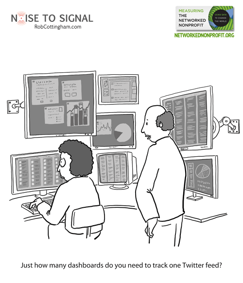
If you respond to Chapter 3 — “Creating a Data-Informed Culture” — the way I did, you’ll start with short-lived disappointment that it’s not about building a new society whose gold standard of conduct is embodied in Brent Spiner’s character from Star Trek: The Next Generation. (And if you read my write-up for Chapter 2, you’ll realize that cruelly taunting science-fiction fans is a hallmark of Beth and Katie’s writing. You’re also one of two people who reads the write-ups under the cartoons, and as the other one, I thank you.)

That brief let-down is followed immediately by surprise, delight, delighted surprise, actionable insights and, ultimately, firmer biceps — the book is heavier than it looks. You’ll learn the difference between being data-driven, where data dictates your actions, and data-informed, where data is one of the factors that guides you — a happier place for most non-profits. And you’ll see how an incremental approach — crawl, walk, run, fly — can allow an organization to adapt naturally and quickly to the demands and opportunities that measurement presents.

2. Hey, you got network in my nonprofit!

2. Hey, you got network in my nonprofit! published on No Comments on 2. Hey, you got network in my nonprofit!

Over the next several days, I’ll be posting cartoons I drew for Measuring the Networked Nonprofit: Using Data to Change the World, by Beth Kanter and Katie Delahaye Paine. Here’s what I blogged about the book a while ago on Social Signal, explaining why I love the book and why I think you should go buy a copy right now.

Measuring the Networked Nonprofit coverChapter 2, “The Rise of the Networked Nonprofit”, is not actually a reference to Terminator 3 (but does hint at one possible direction for a film adaptation, if James Cameron should be interested in optioning it). It reviews the central idea behind The Networked Nonprofitthe superb book Beth cowrote with Allison Fine a few years ago.

That idea: a new kind of nonprofit organization is on the move, one that lets go of rigid structures and expands its impact by making the most of socially networked supporters – many of whom don’t fit into a prefab volunteer role, but instead act as independent free agents.

One of those free agents turns out to have been sent from the future to safeguard Beth and Katie, because in a few years they’ll lead a—

No, wait. I’ll save that for the pitch meeting.

Measuring the Networked Nonprofit: 1. Cute animal theory

Measuring the Networked Nonprofit: 1. Cute animal theory published on No Comments on Measuring the Networked Nonprofit: 1. Cute animal theory

I can’t tell you just how proud, thrilled, delighted and giddy I feel every time I see a copy of Measuring the Networked Nonprofit: Using Data to Change the World, by Beth Kanter and Katie Delahaye Paine (reigning queens of non-profit social media and measurement for organizational communications, respectively.) It’s a fantastic, potentially world-changing book… and I got to draw the cartoons for it.

I blogged about the book a while ago on Social Signal, explaining why I think it’s important (and why I think you should go buy a copy right now):

It’s a momentous book. Organizations from governments to businesses to community groups to nonprofits have all struggled with whether and how to engage with the networked social world, especially when resources are scarce and stakeholders are feeling skittish. Measuring the Networked Nonprofit opens up new possibilities for accountability, learning, innovation and greater impact.

Over the next few weeks, I’ll post my cartoons from the book. And I hope they’ll help prompt you to go snag yourself a copy. Whether you work for a nonprofit, a business, a government agency or just your own efforts to make your corner of the world a little better, you’ll find it a thorough, practical guide to having a far greater impact on the world — and knowing just what that impact is.

* * *

This cartoon kicks off the book’s introductory chapter, which starts with the emerging media director of the Human Society of the United States snapping a photo of her dog in a party hat. It’s related to Beth’s Cute Animal Theory, which owes something to both Nicolas Kristof and Ethan Zuckerman: “Ethan points out that the Web was invented so physicists could share research papers, but Web2.0 was invented because people want to share cute pictures of their cats.  These same tools become very powerful in the hands of activists.”

So be nice to your dachshund, tabby or Betta fish. They may be the key to global transformation.

Twister the Betta fish

Ernst Stavro Blofeld would like to be your friend

Ernst Stavro Blofeld would like to be your friend published on 5 Comments on Ernst Stavro Blofeld would like to be your friend

Metrics. They’re so tempting to chase, because you can so easily see your progress: this many Likes. This many friends. This many retweets. This many uniques.

But very few metrics have ultimate meaning; they’re mostly means to an end. Maybe that end is profit. Maybe it’s social change. Maybe it’s finding love in an uncertain world. (And for the record, “two hearts beating as one” is too a measurable outcome.)

Don’t just obsess about metrics. Interrogate them. Skeptically. “Yeah? So what?” is a solid opening question. Once you get that answer, so is “Since when?” Sometimes “Says who?” isn’t a bad one either.

Otherwise, we end up chasing metrics instead of goals. We follow tactics instead of strategy. And instead of focusing on that one thing we truly want to achieve, we settle for being a hundred people’s ninth favourite thing.


I will grasp at any straw, no matter how thin, to do a Bond cartoon. This probably wasn’t my most technically proficient cartoon ever… but it was fun as hell to draw.