
Originally posted on ReadWriteWeb
In times of horrific disaster, we want to reach out and help. That’s especially true if we’ve actually seen events unfold in front of us as they happened, whether it’s on live TV or Twitter.
For the organizations and agencies that raise money to provide relief, this is a critical time. Potential donors are seized with the urgency of the situation – and are flocking to their websites.
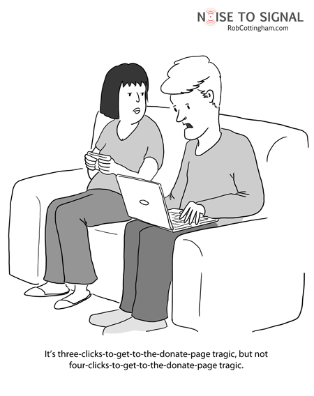
Which means usability suddenly takes on even greater importance. Add one form field too many, program in an unnecessary intermediate step, put a button here instead of there, and you can lose those donors… and the money they might have given.
That might sound silly and irrational, and it is. Nobody deliberately makes the calculated decision that their compassion for another human being is outweighed by the inconvenience of a poorly-coded pull-down menu.
But unconsciously, that’s exactly what happens: some part of our brain figures we’ve clicked one too many times, and bails on a cause we care about. Maybe that doesn’t speak well of us as a species, but it speaks volumes about the importance of usability testing.
On the other hand, our less rational sides can sometimes make us donate when we perhaps should be taking a step back and looking critically at the recipient. The folks at Charity Navigator have a series of suggestions for you to consider before you make your contribution to help folks in Japan, and it’s well worth reading.
How usability affects online fundraising is just one of the things I’ll be looking to learn more about next week at the Nonprofit Technology Conference in Washington, DC. I’ll be cartoon-blogging the event; if you’re coming too, be sure to say hi.