
Look at this type, isn’t it neat?
Wouldn’t you say my descenders are sweet?
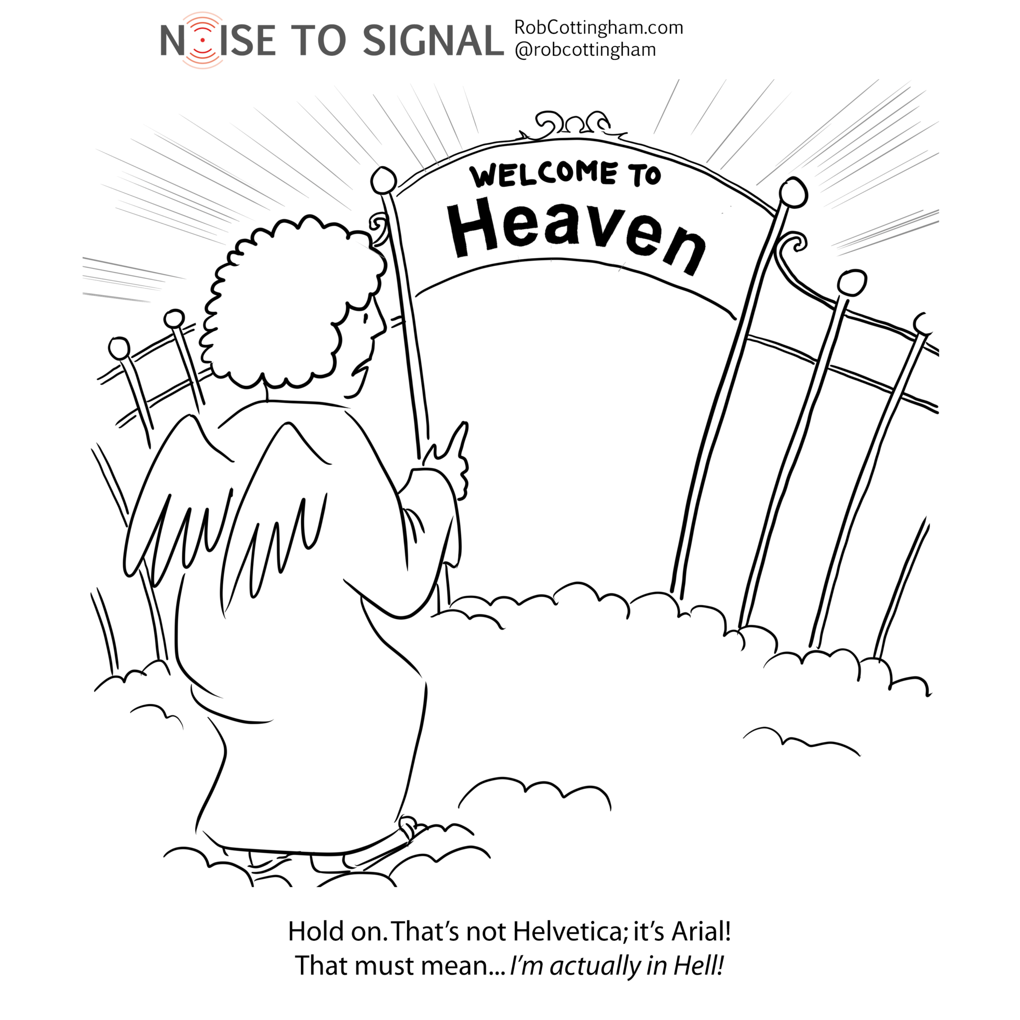
Wouldn’t you think ‘Hey, that font: it’s Helvetica’?—Arial, from Disney’s The Little Typeface
You can probably get a pretty good idea of how old a design geek is by asking them if they’ve ever run Ventura Publisher. Or if they know what Letraset is. Or if they’ve ever run strips of typeset galleys through a waxer, and made last-minute corrections with an X-Acto knife or an Olfa cutter. (If they start going on about casting type using molten metal, doff your cap and take a knee: you’re in the presence of living history.)
One interesting variable: the further back in time you go, the fewer typefaces those designers are likely to have had access to. (My rough math suggests you reach zero typefaces in roughly 1832, at which point you end up with a negative number of typefaces. In other words, Comic Sans.) Today, we can choose just about any font around, and if we don’t want to shell out for a commercially licensed version of one of the older typefaces, there’s sure to be a knockoff kicking around free for the downloading. (Although the kerning tables may be a little off.) Not to mention the freshly-redesigned Google Fonts.
And yet despite all this choice, a lot of us keep coming back to Helvetica.
Of course, there are factions: the Helvetica classicists versus the Neue guard; Black versus Ultra Light. And there are defectors: Facebook, for instance, seems to be testing (gasp) Geneva—or, on my desktop right now, San Francisco. But show me another typeface with its own documentary.
(Bonus link: See if you can tell the difference between Helvetica and Arial in situ!)
1 Comment
Well, I will always have a soft spot for Gill Sans, which also has a documentary – at least a 5 minute one: