Skip to content

Time to put the “not” in “notifications”

Time to put the “not” in “notifications” published on No Comments on Time to put the “not” in “notifications”

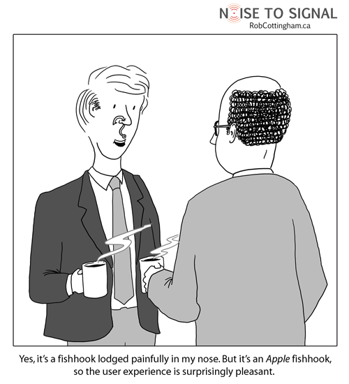
I’m not sure when it happened. But at some point my laptop and smartphone stopped being places of work, creativity, conversation and leisure, and started being the dashboard of a highly-strung car. Suddenly, I’m surrounded by notifications.

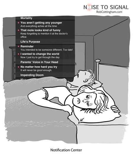
Three new email messages. Five things just happened on Facebook. Four people have mentioned, DM’d or retweeted me on twitter. Six Google+ alerts. LinkedIn on the iPhone now feels the need to notify me that I can always check it to see what my contacts are up to. (That has to be the ultimate meta-reminder: an app reminding you that it still exists.)

And if I still don’t feel like I have the pulse of my system at my fingertips, I can install a shareware utility to notify me of all sorts of involuntary muscle movements on the part of my operating system and applications. “Backup complete.” “Word just updated itself.” “Photoshop just completed peristalsis.”

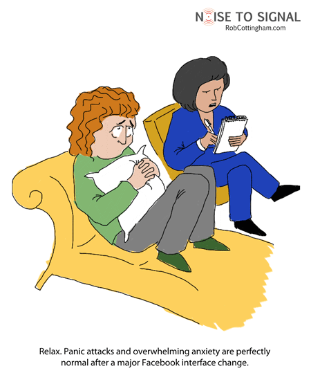
And it’s all too much. Because every one of those notifications conveys the same red-badged “deal-with-me-NOW” sense of extreme urgency, whether it’s a DM that my house is on fire and I should do something about it, or the announcement of the new Rabid Parakeet in Angry Birds. When everything’s important, nothing’s important.

The first few times I experienced notifications, I felt like the Terminator, with that cool heads-up display constantly alerting me to my surroundings, feeding me tactical data. After a while, though, it just feels like being 10 years old in the back seat with a pesky sibling who keeps poking you in the side.

Besides, once I have badges on my iPhone apps with numbers like “62” on them, the game is lost anyway, and all that those notifications are doing is rubbing salt into the wound.

Originally posted on ReadWriteWeb

Plus ça change, plus c’est différent

Plus ça change, plus c’est différent published on No Comments on Plus ça change, plus c’est différent

Another week, another massive change to Facebook. I’ve done the developer workaround to get Timeline added to my profile, and now I have to plow through several years of my life to remove hideously embarrassing incidents lend some coherence to it.

And listen, I’m all in favor of them innovating and offering amazing new features to their users. I haven’t decided whether I actually like Timeline yet, but I’m impressed as hell with what they’ve done with it.

That said, hold up, guys. Being a Facebook user these days is like being a hamster belonging to a five-year-old who lives on a diet of Froot Loops and espresso, and has a limitless supply of Habitrail parts: “What the hell… my water bottle was right herea second ago! And the food pellets… what do I click to get to the damn food pellets?!” Before you know it, you have to supplement their diet with Rativan.

Take a breath, Facebook, and let the community catch up.

Click (and click, and click) to donate

Click (and click, and click) to donate published on No Comments on Click (and click, and click) to donate

Originally posted on ReadWriteWeb

In times of horrific disaster, we want to reach out and help. That’s especially true if we’ve actually seen events unfold in front of us as they happened, whether it’s on live TV or Twitter.

For the organizations and agencies that raise money to provide relief, this is a critical time. Potential donors are seized with the urgency of the situation – and are flocking to their websites.

Which means usability suddenly takes on even greater importance. Add one form field too many, program in an unnecessary intermediate step, put a button here instead of there, and you can lose those donors… and the money they might have given.

That might sound silly and irrational, and it is. Nobody deliberately makes the calculated decision that their compassion for another human being is outweighed by the inconvenience of a poorly-coded pull-down menu.

But unconsciously, that’s exactly what happens: some part of our brain figures we’ve clicked one too many times, and bails on a cause we care about. Maybe that doesn’t speak well of us as a species, but it speaks volumes about the importance of usability testing.

On the other hand, our less rational sides can sometimes make us donate when we perhaps should be taking a step back and looking critically at the recipient. The folks at Charity Navigator have a series of suggestions for you to consider before you make your contribution to help folks in Japan, and it’s well worth reading.

How usability affects online fundraising is just one of the things I’ll be looking to learn more about next week at the Nonprofit Technology Conference in Washington, DC. I’ll be cartoon-blogging the event; if you’re coming too, be sure to say hi.


Edge cases of the third kind

Edge cases of the third kind published on 2 Comments on Edge cases of the third kind

Originally posted on ReadWriteWeb.

Hard to believe it’s already been a year since I posted my farewell to Internet Explorer 6. (By “farewell” I meant “Just frickin’ die already.”)

My post was prompted by the announcement that support was ending for IE6 on Google Apps; since then, IE6’s decline has accelerated, dwindling into low-single-digit percentages of browser visits (if that) on most of the sites I manage.

And this week, the latest heavyweight jumped on the let’s-kill-IE6 bandwagon: Microsoft, which launched the Internet Explorer 6 Countdown site. It sets a target of reducing IE6 usage to less than 1% worldwide.

“For the love of god, please stop using our product” is an unusual message, but it’s a welcome one from Redmond. I’ve already been told by one client not to bother supporting it – which is superb news.

So if you haven’t already struck IE6’s installed base off your list of users you have to support, chances are you’ll be doing it sometime in the next few months.

But don’t feel too smug. If there’s anything to the latest sensational headlines from astronomy news(and that might be a big if), we might have a whole new group of use cases to consider.


Turns on a dime. Whether you want it to or not.

Turns on a dime. Whether you want it to or not. published on 4 Comments on Turns on a dime. Whether you want it to or not.

Also, it would yell loudly about who you were, where you were going and who you were going to meet there. There’d be a switch to turn that off. It would be located behind the catalytic converter on the underside of the car, and would be functional only when the car was moving at freeway speeds.

* * *

An interesting conversation unfolded after this first appeared on ReadWriteWeb. Here’s what I wrote there:

For those of us who develop apps or manage engagement strategy, is there any platform more infuriating, any terrain less stable, any regime more prone to arbitrary and capricious rule changes than Facebook?

Goodbye “fans”; hello “like”. Goodbye boxes; hello profile tabs. Goodbye contests-with-dairy-products-as-a-prize; hello you-can’t-have-contests-with-dairy-products-as-a-prize.

I’ll say this much: My work in Facebook has allowed me to better embrace the impermanence of all things.

A commenter suggested this is a radical field, change is to be expected, and (to paraphrase) roll with it, dude. I replied (grumpily) that “constant incremental Agile-style change, I can cope with. More significant change based on some kind of rationale or, better yet, roadmap, I can embrace. But for years, Facebook has been notorious for dropping bombshells from out of the blue, and making unannounced or poorly document under-the-hood changes that break apps and make developers’ lives hell.”

Can you tell I carry a grudge from the promotion guidelines fiasco?

Anyway, what do you think? Do I need to lighten up and embrace Facebook’s turbulence, even when clients’ budgets are on the line? Or is that just giving in to (quote from that same reply) to “disregard for customer, user and developer communities”?

And there’s a huge selection of attractive cases for it

And there’s a huge selection of attractive cases for it published on 4 Comments on And there’s a huge selection of attractive cases for it

Tell me you wouldn’t at least look at it in the store.

Right, I thought so. Me too.

Like the cartoon?
Check out the mug from
the Noise to Signal store!

The fishhook through your cheek. From Apple.